
Edit+ Editor
Last Updated: 04 Jan 2016
Edit+ features a very powerful and user-friendly WYSIWYG (What You See Is What You Get) Content Editor, providing an intuitive interface for creating and maintaining the content of your assets.
The tools and settings found on the Edit+ Editor WYSIWYG Content Container are outlined in the sections below. You can select one of the button types below to view the information for that tool.
Adding a New Content Container
The content of pages within a site is maintained through Content Containers. To add a new Content Container, click on the Insert New Container icon; the Insert New Container pop-up will appear.
In the Insert New Container pop-up, define the Identifier, Style Information and Content Type settings. Once you have configured these fields, click the Insert button; a new Content Container will appear on the Content screen.
The options available on the Insert New Container pop-up are similar to those displayed when adding a new Division in the backend. For more information on these fields, refer to the Page Contents and Divisions chapter in the Concepts manual.
Please note that currently, you are only able to create additional Content Containers on Standard Page assets.
Reordering the Content Containers
When you have multiple Content Containers on an asset, you can modify their order, redefining the content of your page. To reorder the Content Containers on the Content page, click on the Change the Order of this Container icon; the Reorder Content Containers pop-up will appear, as shown in the figure below.

The Reorder Content Containers pop-up
The Reorder Content Containers pop-up lists the Content Containers on the asset, allowing you to rearrange their order through a drag-and-drop process. Once you are satisfied with the new order of the Content Containers, click the Save Changes button; the Content screen will reload with the new container structure.
Please note that currently, you are only able to reorder Content Containers on Standard Page assets.
Deleting a Content Container
To delete a Content Container on an asset, click the Delete Container icon; a pop-up will appear, confirming the deletion of the Content Container, as shown in the figure below.

The Delete Container pop-up
Click Confirm to approve the deletion of the Content Container; the Content screen will reload and the Content Container will be removed.
Please note that you must have at least one Content Container on your asset. If you only have one Content Container, the Delete Container icon will not appear and you will not be able to delete this container.
Configuring the Container Display Conditions
To enable and set conditions on a Content Container, click on the Edit Display Conditions icon; the Container Display Conditions pop-up will appear, as shown in the figure to the below.

The Container Display Conditions pop-up
The Container Display Conditions pop-up allows you to enable display conditions and configure the conditions for displaying content within the selected Content Container.
Tip: the options available on the Edit Container Properties pop-up are similar to those displayed when editing the properties of a Division in the backend. For more information on these fields, refer to the Page Contents and Containers chapter in the Concepts manual.
When Conditions have been set on a Content Container, the Edit Display Conditions icon will be highlighted grey. When the set Conditions have been enabled, this icon will turn orange, as shown in the figure below.
The Edit Display Conditions icon with Conditions set and applied
Editing the Properties of a Content Container
To edit the properties of a Content Container click on the Edit Container Properties icon; the Edit Container Properties pop-up will appear.
The Edit Container Properties pop-up allows you to reconfigure the Identifier, Style Information and Content Type settings of the Content Container.
The options available on the Edit Container Properties pop-up are similar to those displayed when editing the properties of a Division in the backend. For more information on these fields, refer to the Page Contents and Containers chapter in the Concepts manual.
Inline Editing
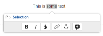
An inline editing toolbar
The Edit+ Editor WYSIWYG Content Container provides efficient and accessible content revision through the use of inline editing. Clicking and selecting text within the content of a WYSIWYG will display the editing toolbars directly below the selected content, providing editing tools specific to the content that is being modified, as shown in the figure below.
These inline toolbars allow you to edit the content of your assets within their immediate context, mitigating the need for constant referral back to WYSIWYG's toolbar.
Inline toolbars also provide breadcrumb style navigation of the elements of your selected content, allowing you to specify exactly the content you are editing. For example, in the figure to the right, you can use the navigation tools to edit only the content that has been selected, all content within the bold tags of the selection, or all content within the paragraph of the selection.

Basic Formatting
Adding a Comment
The tools available on the inline toolbar allow you to add comments to your content, aiding in content collaboration on pages with multiple authors.
To add a new inline comment, make a content selection and click the Add Comment button; the New Comment pop-up will appear, allowing you to insert a new comment on the selected content.
Inline comments within the content of a page will be reflected as speech balloons to the right of your content, as shown in the figure below. Clicking these icons will display the comment and its history, and allow other content editors to reply to the comment thread.

An inline comment within the content of a page
Comments can be resolved by clicking the Mark as Resolved toggle; resolved comments' icons will be greyed out and marked with a tick.
Content editors can edit their comments by selecting Edit Comment. You can also delete a comment by clicking the Mark for Deletion button and saving your content.
The %asset_attribute_comments% keyword can also be used to print all of the comment data from a Standard Page or a Content Container in a JSON array.
The inline comment plugin tool is only supported for assets with Content Containers in them, like Standard Pages. It is not supported for News Items and Calendar Events.
Basic Formatting: Bold, Italic and Strikethrough
The Edit+ Editor WYSIWYG Content Container provides the basic formatting tools to allow you to make your content bold or italicised, as well as strikethrough text.
To use these basic formatting tools, make a content selection and click either the Bold, Italic or Strikethrough buttons; the content will be modified, as shown in the figure to the right.
To remove this formatting, simply highlight the relevant content (the format buttons will be highlighted if formatting has been applied) and click the button of the formatting you want to remove. Alternatively, you can use the Remove Formatting tool.
<strong>Bold</strong><em>Italic</em><del>Strikethrough</del>You can use shortcuts for both bold and italic formatting. For Windows: Ctrl+B (bold) and Ctrl+I (italic); for Mac: CMD+B (bold) and CMD+I (italic).
Making Text Subscript or Superscript
The Subscript and Superscript tools in the Edit+ Editor WYSIWYG Content Container allow you to format your content selections as both subscript and superscript.
To use these formatting tools, make a content selection and click either the Subscript or Superscript buttons; the selected content will be formatted as specified. To remove this formatting, highlight the relevant content (the Superscript or Subscript buttons will be highlighted if formatting has been applied) and click the button of the formatting you want to remove. Alternatively, you can use the Remove Formatting tool.
Marking Text as Code
The Code tool allows you to highlight parts of your text as code. When applied to a selected piece of text, it will be wrapped in a <code> tag.
This is useful for when you are writing technical documentation and you need to highlight certain words or snippets in a tag that represents computer code.
Click here to read up on more information about the use of the <code> tag.
Applying a Class to Content

The Class pop-up
The Class tool in the Edit+ Editor WYSIWYG Content Container allows you to apply a class attribute within your content.
To apply a class, make a content selection and click the Class button; the Class pop-up will appear, as shown in the figure to the right.
In the Class field, enter the class name to use and click the Update Changes button.
To delete a class, highlight the relevant content and click the Class button; the class information will be displayed in the Class field. Delete the previously set class and click Update Changes. Alternatively, you can use the Remove Formatting tool.
<h1 class="intro">Heading</h1> Removing Formatting
The Remove Format tool in the Edit+ Editor WYSIWYG Content Container allows you to remove any text formatting (bold, italic etc.) within your content while maintaining the text itself. This includes clearing any style attributes, classes, and justifications within your content.
To remove formatting, make a content selection and click the Remove Format button; the content will now be clear of any text formatting.
The following HTML tags are not allowed within the WYSIWYG and will always be stripped:
- <script>
- <form>
- <input>
- <textarea>
- <button>
- <select>
- <label>
Disallowed HTML tags can sometimes be added to this component type accidentally through an API update, or when a Code component is converted to a WYSIWYG component.
An error appears describing the issue when this situation occurs:
HTML contents of this container interfere with the edit interface.
WYSIWYG editor has been disabled for this container.
Below is the raw HTML content.
Search for these tags in the content and remove them to reactivate WYSIWYG editing again.
Aligning Text: Left, Right, Center and Block
The Toggle Justification tool in the Edit+ Editor WYSIWYG Content Container allows you to specify the horizontal alignment of selected content; either left-aligned, right-aligned, centered or block (i.e. justified) text.
To set the alignment of your content, click the Toggle Justification button; the Justification pop-up will appear, as shown in the figure to the right.
Select the justification setting you wish to use: Left Justify, Center Justify, Right Justify or Block Justify.
Applying a Format

An inline editing toolbar
The Formats tool in the Edit+ Editor WYSIWYG Content Container allows you to control the formats of your content, whether they be paragraphs, divisions, quotes or preformatted content.
To specify the formats of your content, make a content selection and click the Formats button; the Formats pop-up will be displayed, as shown in the figure to the right. The current format type of content will be selected. In this case, the P option is selected, indicating that this content is using paragraph tags.
In the Formats pop-up, select the format you want to switch to.
<p>Content</p><div>Content</div><blockquote>Content</blockquote><pre>Content</pre> Adding a Header

The Headings pop-up
The Headings tool in the Edit+ Editor WYSIWYG Content Container allows you to add a header tag to the selected content.
To add a header tag, click the Headings button; the Headings pop-up will appear, as shown in the figure to the right.
Select either H1, H2, H3, H4, H5 or H6 to apply the corresponding header tags.
Undoing and Redoing Actions
The Undo tool in the Edit+ Editor WYSIWYG Content Container allows you to undo an action that you have made to your content. This is useful if you have made a mistake, such as deleting a paragraph, and want to revert the changes you have made.
To undo an action, click the Undo > button; the last action will be undone. You can click this button multiple times to undo previous actions made.
If you then decide that you want to redo the action, clicking the Redo button will reinstate the changes that had previously been made.
Creating Ordered and Unordered Lists
The listing tools in the Edit+ Editor WYSIWYG Content Container allow you to create ordered (numbered) and unordered lists within your content.
To create a list, click on either the Make Ordered List (to make a numbered list), or Make Unordered List (to make a bullet-point list) buttons. The selected list type will appear in the WYSIWYG container where you can begin entering the content for your list.
Alternatively, you can convert existing content into a listed format by making a content selection and then clicking one of the available list buttons; the content will be converted into the selected list type.
<ol> <li>Bread</li> <li>Butter</li></ol><ul> <li>Cat</li> <li>Dog</li></ul>To remove a list, highlight the relevant content (the list buttons will be highlighted if a list type is being used) and click the corresponding list button that you want to remove.
Indenting and Outdenting List Content
The Indent List and Outdent List tools in the Edit+ Editor WYSIWYG Content Container allow you to control list item indentation within the lists in your content.
To indent a list item, place your cursor within a list item and click the Indent List button; the selected list item will be indented to a lower list level.
You can control the list levels of your list items using the Indent List button along with the Outdent List button.
<ul> <li>Apple <ul> <li>Orange</li> </ul> </li> <li>Mango</li></ul>
The Insert Table pop-up
Creating, Editing and Maintaining Tables
The Insert Table tool in the Edit+ Editor WYSIWYG Content Container allows you to insert a table into the content of your asset.
To insert a table, click on the Insert Table button; the Insert Table pop-up will be displayed, as shown in the figure to the right.
In the Insert Table pop-up, specify the Size of the table to insert and indicate the position of the table Headers.
Once you have done this, click the Insert Table button; the table will be inserted into the content of the Content Container, as shown in the figure below.

A table inserted in the Content Container
Once a table has been inserted, you can modify its settings by selecting the table within the Content Container and clicking the Insert Table button; you will be able to select to modify either the entire table or the selected row, column or cell.

The Table, Row, Column and Cell Tools pop-ups
The settings in these tools allow you to define the width of the table; specify a table summary; insert a caption for the table; insert and move rows and columns; merge and split cells; add CSS classes; add headers; and delete rows, columns, cells or the entire table.
Inserting an Image

The Insert Image pop-up
The Insert Image tool in the Edit+ Editor WYSIWYG Content Container allows you to insert an image into the content of your asset, either as an Image asset within your Site or via the URL of the image. For more information on creating and editing Image assets, refer to the Asset Creation Wizard and Editing an Image chapters in this manual.
Click on the Toggle Image Options button to insert an image; the Insert Image pop-up will be displayed, as shown in the figure to the right.
In the Insert Image pop-up, enter a URL to the image that you want to insert. Alternatively, you can specify to insert an Image asset from within your Site or upload an image from your computer.
To insert an Image asset, click the Pick Asset button; the Asset Finder will be displayed, where you can navigate to and select the Image asset to add.
If you want to upload an image, click the Upload button and select the image you want to insert; an additional Location field will be displayed, allowing you to specify where in your system you want to upload your image. By default, the Use current asset as upload location option will be selected.
You can select whether or not to display this new image asset within the navigation menus of your site using the Show in Menu option. By default, this field will be disabled, meaning that the image will be uploaded as a Type 2 linked asset and will not be displayed in the menus of your site.
You can copy and paste images directly from a Word document or a folder on your local computer. You can even drag and drop multiple images at once. This functionality is available on all latest Firefox, Chrome and Safari browsers, as well as IE10 and 11.
Once you have specified an image to insert, the Insert Image pop-up will display the image that is to be inserted.
The Insert Image pop-up also allows you to indicate whether the image that is being inserted is decorative or not, and provide a title for the image and any require alternate text. For more information on the settings of an image, refer to the Editing an Image chapter in this manual.
Once you have selected and configured the image to insert, click the Update Changes button; the image will be inserted into the content of your Content Container, as shown in the figure below.

An image inserted in the Content Container
You can resize your image by selecting the image within the Content Container; resize 'handles' will appear in the bottom corners of your image, allowing you to drag your image to the desired size.
To modify the settings of an image once it has been inserted, select the image within the Content Container and click the Toggle Image Options button; the Insert Image pop-up will be displayed, listing the current settings of the image. Once you have reconfigured these settings, click the Update Changes button to update the image.
Inserting a Horizontal Rule

Inserting a horizontal rule
The Horizontal Rule tool allows you to create a horizontal line within your content, used to define a thematic break.
<hr />To insert a horizontal rule, click the Horizontal Rule button; the line will be created, as shown in the figure to the right.
Adding and Removing Links

The Insert Link pop-up
The Insert Link and Remove Link tools in the Edit+ Editor WYSIWYG Content Container allow you to manage links to external sites and/or internal assets within your content.
To add a link:
- Make a content selection and click the Insert Link button to load the Insert Link pop-up (shown in the figure to the right).
- In the URL field, enter the URL address you want to link to, including the protocol. For example,
https://www.squiz.net. Alternatively, you can click the Pick Asset button to select an internal asset to link to, using the Asset Finder. - In the Title field, enter a title for the URL. This value is assigned to the HTML title attribute on the <a> tag.
- Select the Open a New Window option if you want this link to open in a new browser tab.
- Once you have configured the settings in the Insert Link pop-up, click the Update Changes button.
To remove a link:
- Select the link in the content.
- Click the Remove Link button.
If you are linking to a Link or Redirect Page asset, there will be another option available called Use Link Destination which is on by default. When enabled, the URL produced on the frontend is the URL those asset types are pointing to rather than the URL of the Link or Redirect Page asset themselves.
Adding an Anchor ID

Adding an anchor ID
The Anchor ID tool in the Edit+ Editor WYSIWYG Content Container allows you to insert an anchor or destination point within the content of a page. These anchors can then be linked to, enabling quick navigation to the content within your Site. For example, you could create links at the top of a page to each separate section of content within that page.
To insert an anchor ID, make a content selection and click the Anchor ID button; the Anchor ID pop-up will appear, as shown in the figure to the right.
In the ID field, enter an ID or name for the anchor and click the Update Changes button.
<h1 id="edit-plus">
  Edit+ makes content editing easier than ever before.
</h1>
To delete an anchor ID, highlight the relevant content and click the Anchor ID button; the anchor information will be displayed in the ID field. Delete the previously set ID and click Update Changes.
Using Special Characters
The Insert Character tool in the Edit+ Editor WYSIWYG Content Container allows you to add special characters into the content of your page.
To insert a special character, click the Insert Character button; the Insert Character pop-up will appear, as shown in the figure below.

The Insert Character pop-up
The characters available on the Insert Character pop-up are grouped under either Symbol, Latin, Mathematics and Currency categories. Click on a character to insert it into the content of your page.
Searching and Replacing Content

The Search & Replace pop-up
The Search & Replace tool on the Edit+ Editor WYSIWYG Content Container allows you to search the content in the WYSIWYG container, with the option of replacing this content with a specified string. For example, you could search for all uses of the phrase Squiz Matrix in your content, replacing those instances found with the phrase Edit+.
To search and replace content, click the Search & Replace button; the Search & Replace pop-up will appear, as shown in the figure to the right.
In the Search field, enter the string to search for; you can do a basic content search of this phrase by then clicking the Find Next button. If you want to replace this string within your content, enter the replacement string in the Replace field. Clicking the Replace All button will replace all instances within your content. Alternatively, you can replace individual instances by using the Find Next and Replace buttons to locate and replace the found string.
Using the Language Tools

The Language Tools pop-up
The Language Tools within the Edit+ Editor WYSIWYG Content Container allow you to insert acronym, abbreviation and language tags within your content.
To use these tools, make a content selection and click the Language Tools button; The Language Tools pop-up will be displayed, as shown in the figure to the right.
To add an acronym tag, click the Acronym button; the Acronym field will appear. In this field, enter the acronym information you want to include and click Update Changes.
<acronym title="as soon as possible">ASAP</acronym>To add an abbreviation tag, click the Abbreviation button; the Abbreviation field will appear. In this field, enter the abbreviation information you want to include and click Update Changes.
<abbr title="New South Wales">NSW</abbr> To add a language tag, click the Language button; the Language field will appear. In this field, enter the language information you want to include and click Update Changes.
<span lang="fr">Bonjour!</span> The Accessibility Auditor
The Edit+ Editor WYSIWYG Content Container's Accessibility Auditor tool evaluates and reports on the accessibility of the content of your asset, highlighting any known or potential issues for review and resolution.
The Accessibility Auditor is accessed via the icon; the Accessibility Auditor pop-up will appear, as shown in the figure below.

The Accessibility Auditor
For more information on this tool and how it is used, refer to the Accessibility Auditor chapter in this manual.
Viewing the HTML Source Code
The Source Editor tool in the Edit+ Editor WYSIWYG Content Container allows you to view the HTML source code of your content.
To view the content source code, click the Toggle Source View button; the Source Editor pop-up will be displayed, as shown in the figure below.

The Source Editor displaying the HTML source code content
You can use the Source Editor to modify the HTML code of your content. Once you are satisfied with your work, click the Apply Changes button to return to the Edit+ Editor WYSIWYG Content Container.
Using Matrix Keywords
The Insert Matrix Keyword tool in the Edit+ Editor allows you to add a keyword replacement within the content of your page.
To insert a keyword, click the Insert Matrix Keyword button; the Insert Matrix Keywords pop-up will be displayed, as shown in the figure below.

The Insert Matrix Keywords pop-up
This pop-up will display a list of keyword replacements available for use on the asset.
Select the keyword that you want to use and click Insert; the keyword will be added to the page content.
For more information on the keyword replacements available within the Squiz Matrix system, refer to the Keyword Replacements manual.
Inserting a Snippet

The Insert Matrix Snippet pop-up
The Insert Matrix Snippet tool in the Edit+ Editor allows you to insert snippets of content within your page, in a similar manner to linking a division or nesting another asset.
To insert a snippet, click the Insert Matrix Snippet button; the Insert Matrix Snippet pop-up will be displayed, as shown in the figure below.
This pop-up will provide a list of the Bodycopy assets available to use as snippets.
Select the snippet you want to use an click Insert; the keyword for the snippet will be added to the page content.
By default, no snippets will be available for use on this tool. The Snippet Keyword Replace setting must first be enabled on the Global Preferences screen, and a snippet location configured. For more information, refer to the Global Preferences chapter in the System Configuration manual.